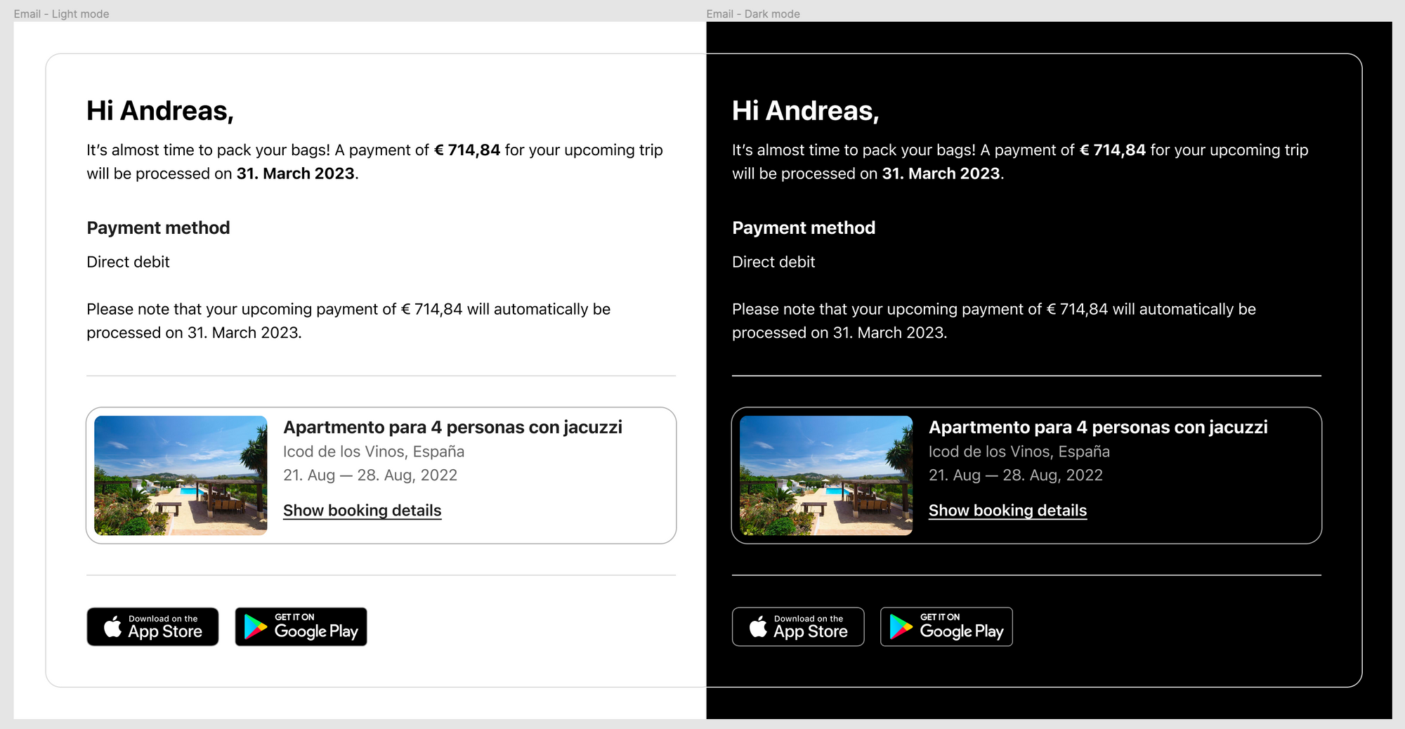
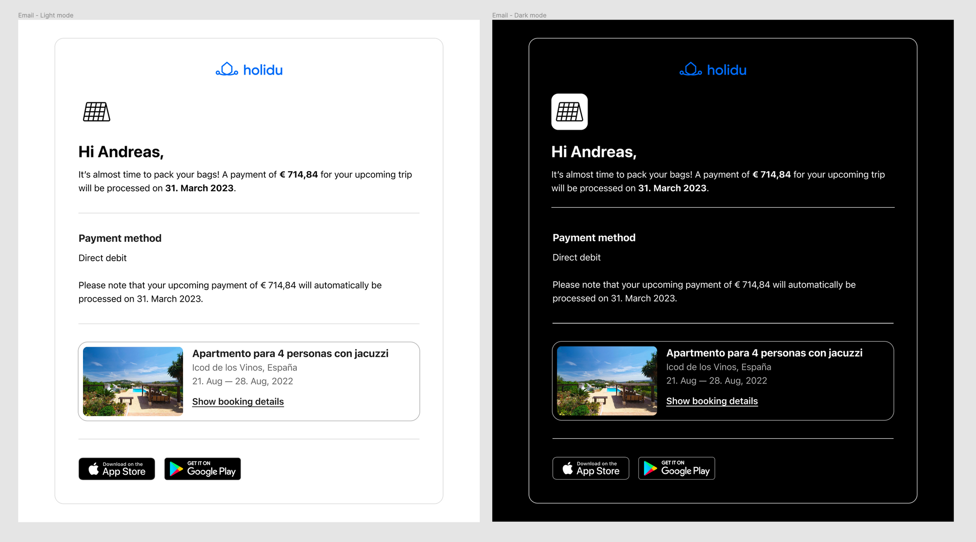
Designing Emails for Dark and Light mode

Today I'd like to share some tips that helped us design an email template that works both well on light mode and looks great on dark mode.
As you might know creating a template that works equally as good on both themes can be quite challenging especially when it comes to using icons or images.
Here are some learnings and tips that you can use for your next email design or template when you face this problem.
Fonts, text & colours
If you want to ensure that your email text will always be legible on every client it is a good practice when you're designing font to always use live text instead of text on images.
In that way the mail client will be able automatically choose which text colour to use.
For example when the system is set to light mode it will default to the system's dark colour for text and vice versa for dark mode. Most cases email clients can detect solid colour and invert it for you.
The main takeaway with text is that using pure white or black text will get swapped in dark mode. The hex code #FFFFFF and #000000 will get swapped in almost all instances.
You can have some control over the text colour with the prefers-color-scheme: dark media query. However, some colours default to inverted, no matter the CSS you have inline or with !important stated.

Borders
When designing borders such as outlines around containers, dividers, or other kinds of borders it always is a problem that the colour either might be too light or too dark.
Most email clients don't support media queries so in that case I'd recommend to find a solid colour that is both light enough and dark enough to work equally as well on either theme.
Logo
If your logo uses a primary colour, it might already look good on both light and dark mode. Check if the colour contrast is enough, and if not you can try the following.

Add an outline or shadow around the logo, it helps the logo stand out on dark mode, while looking unchanged on light mode.
Icons & images
When you design an icon you usually already have a color for it in mind. Whether it's an outline style or filled icon it usually will have a solid colour. This can work on both light and dark mode, however you might face a problem when your icon is supposed to be black: as soon as you switch to dark mode you notice you cannot see the icon anymore.
We've tried multiple things and ended up finding a simple solution that should probably fix this issue once and for all.

The trick is rather quite simple: if you design your emails in light mode as primary colour, then draw rectangle behind your icon with a white background.
On light mode it will look like nothing has changed but as your theme switches to dark mode it will automatically have a white background behind the icon making sure it's always visible.
To make this look even better I'd just recommend adding rounded corners (if that also matches your style) and then exporting it as PNG when using round corners or as JPEG.
Media queries & CSS
Unfortunately, unlike in regular web development most media queries you are familiar with or CSS simply won't work in emails. They often require a lot of workarounds, fixes, or only work on a very limited amount of email clients. All of this results in additional QA testing and potential for a lot of bugs.
Summary
With a few little changes, most email designs can easily be compatible with dark mode on many email clients. All without needing to change the HTML or CSS when you consider how images, logos and icons are displayed and if you do not have any text on background images.
More tricks and tips
There's a good post by Campaign Monitor that goes into depth of some of the tips mentioned here as well as a lot of development advice.
Thanks for reading, have a great day! :D

