Getting user feedback without actually interacting with users

At Holidu, we are working hard to create the world’s best product for searching and booking vacation rentals. To achieve that goal, we are well aware that we need to offer an intuitive, accessible and delightful user experience.
We regularly do user testing sessions with our users to identify their pain points and potential areas to improve our product. Although user testing is proved to be an amazing tool, it requires a great amount of time to prepare and conduct the sessions and interviews. Therefore we were seeking other ways on top of user testing to maximize our feedback channels.
During the user testing sessions, we realized that the simplest questions like “Is there any information missing on this page?” proved to be the most helpful, and we thought “What if we integrate these questions strategically into our website to crowd-source feedback from our users?”.
We identified a couple of places on our website to test this new feedback channel and started to experiment with them. Of course these were all released as A/B tests to monitor and make sure that they do not decrease conversion. Here are three examples we recently implemented:
1. Missing some information?
The first area we wanted to get user feedback on was the apartment details and description. We were wondering if we are showing enough info here for our users or do they miss some info. We implemented a very simple question "Missing some information?" right under that section and waited for user feedback.
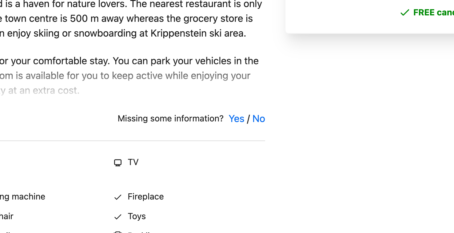
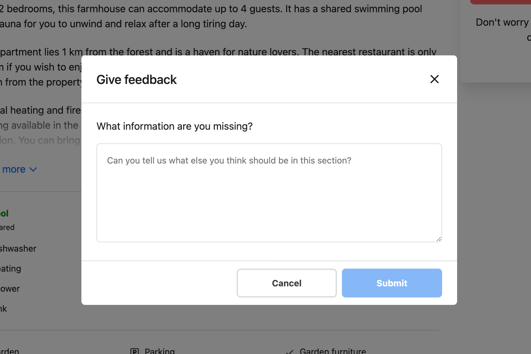
It was shocking to see that we got thousands of feedback messages from our users in the matter of weeks. Of course one challenge here was having feedback in 8 different languages. But Google Translate worked pretty good to convert everything in English with a single click.
Next we analyzed what kind of information our users were missing here on this section. The results showed some interesting findings. Around 40% of the feedback were related to pets. Users were inquiring about whether the pets are allowed or not, how many, what kind or which size pets they can bring with them. Even though we were already aware of that the pet info was important to our users, we realized that we need to put more effort showing more accurate and more comprehensive info.
With this knowledge, we released a number of A/B tests that all are aimed to improve the visibility and quality of pet-related info on our website. And we had very positive results compared to other A/B tests we were launching with our regular product improvement processes.
We realized with the help of this new feature, we are not only gathering an amazing collection of what user's want to see, but we were also identifying critical bugs in our various apartments. For example, a user giving feedback about an enormous "Tourist tax" helped us realize that we have a calculation error that was reflected on thousands of properties, which we fixed promptly thanks to this feedback.
2. Getting feedback from outbound journeys
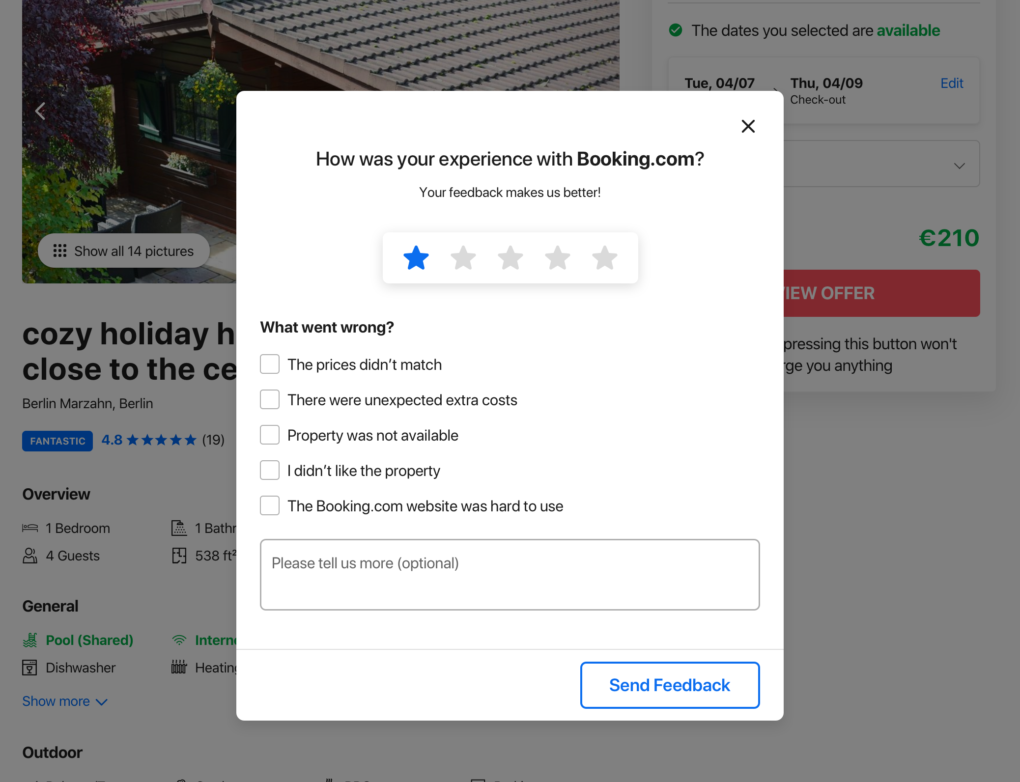
Holidu is a meta-search engine for vacation rentals and about half of the offers on Holidu will redirect users to 500+ different providers like Booking.com, Airbnb or Homeaway. Therefore we do not really have control on the user experience after user is redirected to a provider. However we thought we can implement a simple feedback pop up after user comes back to Holidu from an outbound in order to learn how their experience went with the provider. The hypothesis is that this will increase trust among our users showing them that we value their opinion and are constantly improving our site. Furthermore, we aim to use this form a way of detecting bugs we occasionally have with the providers, especially with the smaller ones.

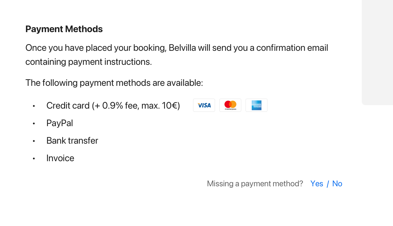
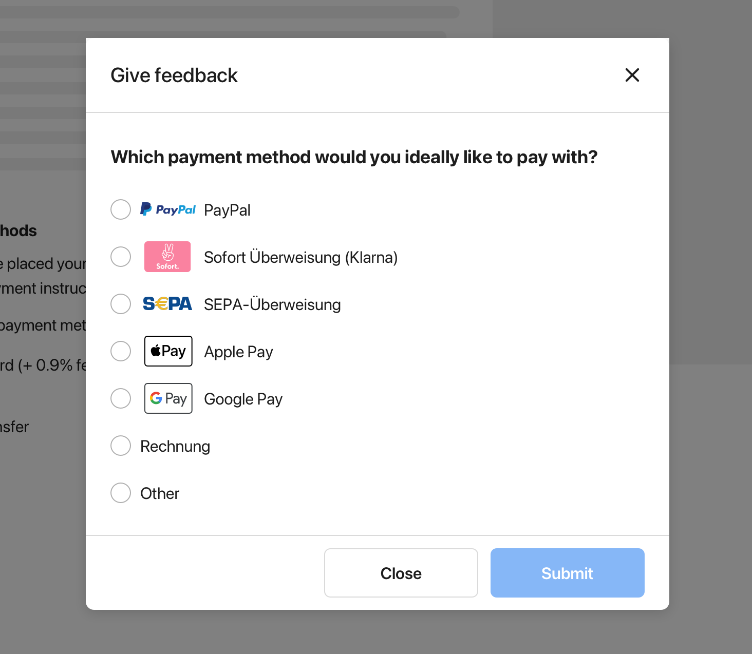
3. Payment methods
On Holidu, we offer "express bookings", meaning that users complete the booking process without leaving our website. Therefore, with certain providers, we accept payments on our checkout funnel. We are constantly improving our checkout experience and adding more payment options proved to be beneficial in the past. However there are so many popular payment methods, especially in German market, which would take a lot of time and effort to implement at once. Therefore in order to prioritize, we wanted to simply ask our users which payment option they would have preferred in the checkout funnel. Based on the input, we are planning to prioritize which payment options to be implemented.
