How we took our Amenities to the next level


Problem statement
Let’s start where you, as a UX designer, start most of your projects. By identifying the problem. When conducting user research on how our users perceive information on our details page, we noticed that a lot of our users struggled with understanding our amenities section.
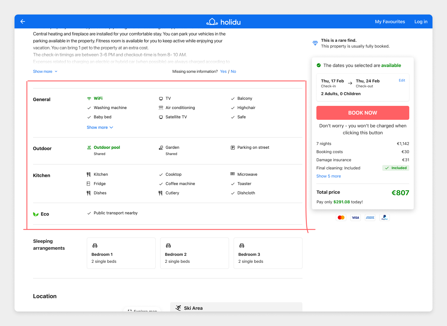
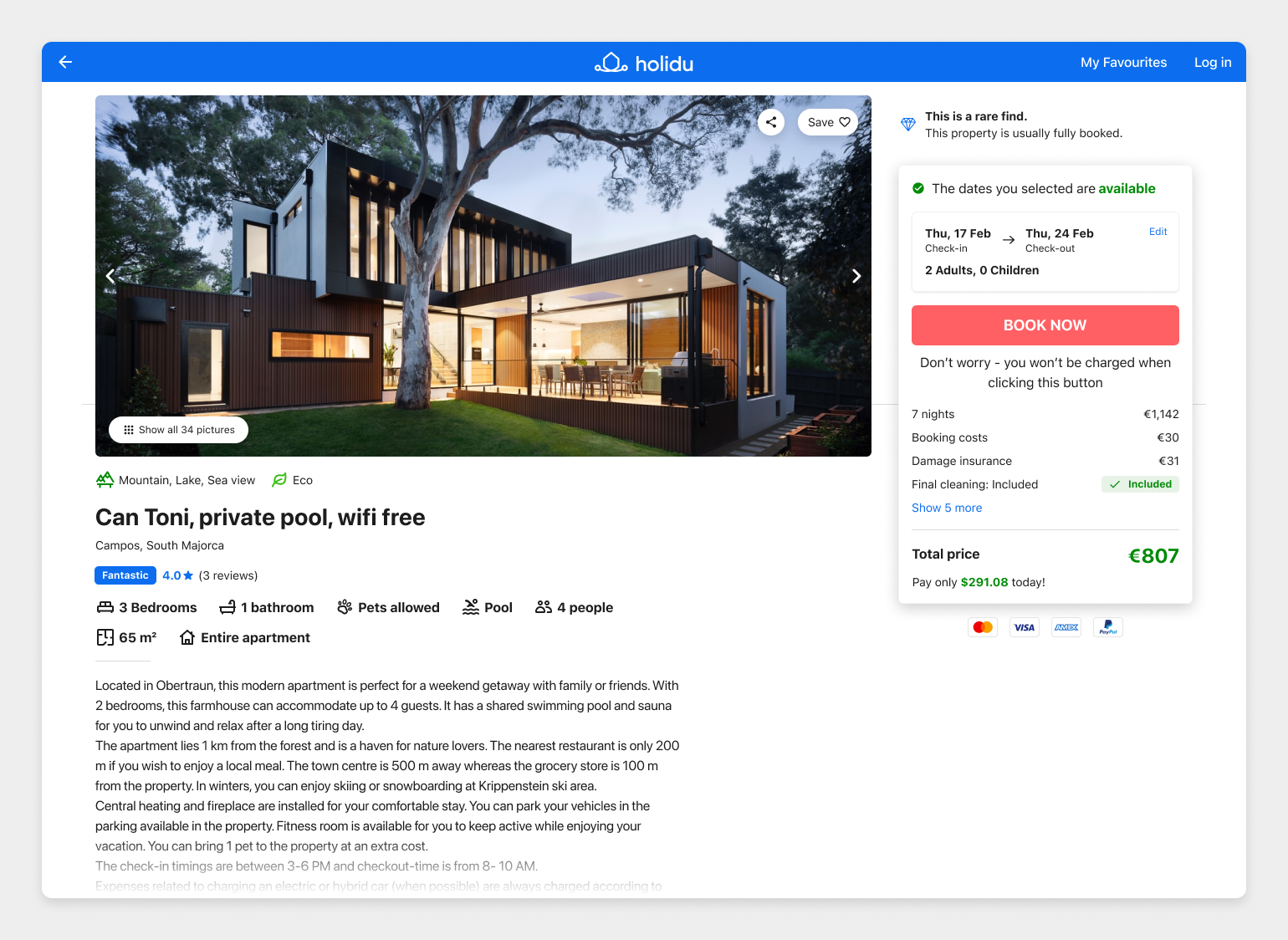
Details page
“The details page” is what we call a part of our product where you are looking at a specific property. The page where you see the big images, read the description, see its location & house rules, and learn about its final price and availability.
So in short, this is where most users learn everything they need, and then decide if they like the property enough that they wanna book it for their vacation and stay in it.
How we improve our product
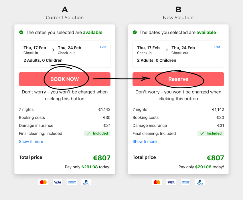
Before we get started, let me explain how we improve the user experience on our website. We run a bunch of A/B tests, which is essentially comparing a new idea (B variant) to the current solution (A variant). An A/B test can be as small as changing some copy on a button or something bigger like creating a new design of a particular section or a whole page. When we are setting up our A/B tests, we also set up some metrics that we will track to see if our B variant is actually an improvement over the old version.
Here’s an example of an A/B test:
Back to the Amenities
The section hasn’t been updated for some time, but it had some recent A/B testing winners like displaying the WiFi & Pool in green.
Based on the insights we gathered, we decided to conduct user research focused only on this part of the page.
We asked the users to find the amenities that the properties offered, and explain to us how this section makes them feel, and how they understand the information displayed.
Their answers were:
- “The one that doesn’t have a checkmark is not included”
- “The ones that do not have a checkmark are not included in the property & price”
- “The amount of information is overwhelming”
- “Why is there no structure, it seems like everything is just thrown in there”
- “Why is the Dishwasher in General and in Kitchen, do they have 2 dishwashers?”
- “Why is the first one green?”
- “Because it’s green it’s guaranteed to be there”
Hypothesis
By reorganizing amenities into new categories, it will be easier for the users to understand them and find specific ones they might be looking for.
You might ask yourself “but why don’t you have icons for all of them?”.
Well, Holidu doesn’t own the amenities data of the properties, our outside providers do, and A) we are always adding new providers (which means also more amenities), and B) the existing providers are adding new amenities, and because our initial solution wasn’t scalable and maintainable we were left behind with designing new icons.
After understanding the problems better, we decided that the 3 main ones we have to solve in this part of the page were:
- The categories are far from optimal to properly accommodate all of the amenities in the correct categories
- Users do not understand the iconography (green icon, black icon, check icon, etc.)
- The amount of information is overwhelming (also, some users do not care about amenities, but we still show them every single one)
Where to start?
The first stop was to solve the categories problem because it would affect the decisions we would make for the 2nd and 3rd problems.
We started by exporting all of the amenities from our database and seeing how they are currently mapped into the categories we show.
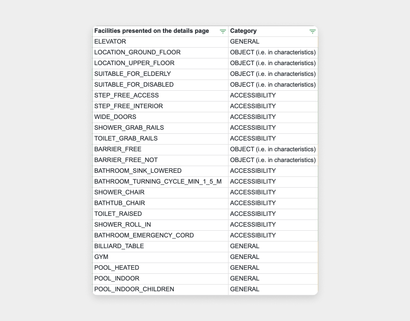
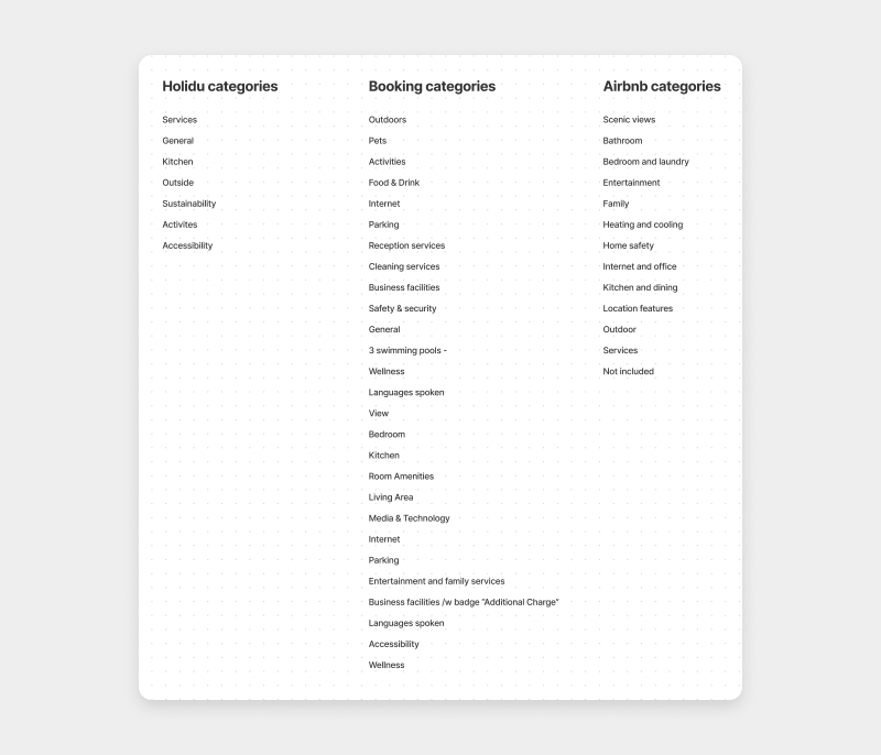
We figured out that we have around 300 amenities (some are “duplicated” like the views) and they were all mapped to 7 different categories:
- Services
- General
- Kitchen
- Outside
- Sustainability
- Activities
- Accessibility
With some very specific amenities like "Parking Garage" or "Pool Toys", it was very difficult to map them into these 7 categories, especially when we wanted the users to really know where to look for specific amenities.
Competitor benchmarking
We went ahead and saw how our competitors and similar products solve these problems and we noticed something pretty shocking:
Notice anything? Airbnb & Booking use somewhere between 12 - 30+ categories (and it’s probably hard to find a property that has ALL of the categories, so the number is probably even higher), which in the worst-case scenario, was at least twice as much as we were using.
Recategorizing
Our idea was to create as many categories that not more than 5-6 amenities would show up in a single category. Looking at the amenities we have, the number of categories would have to be around 15-20.
The new categories we created were:
- Bathroom
- Bedroom
- Kitchen
- Sustainability
- Technology
- Heating & Cooling
- Outside
- Views
- Pets
- Parking
- Activities
- Food
- General
- Laundry
- Safety & Security
We also considered Groups, Office and Nearby as categories but in the end, decided against it because too many categories would also be overwhelming and users would have a hard time deciding in which categories they should be looking for specific amenities.
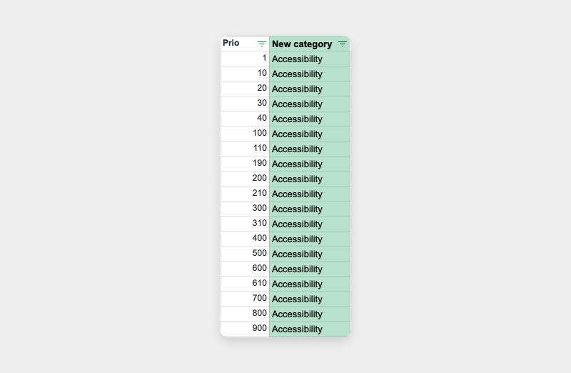
What we have also done, is assign a priority number to each amenity inside each category, so that the “more important ones” would show up further up in the design.
So now, let’s get to the second problem - our users not understanding iconography
It was clear that the users have a hard time understanding icons because there were so many different ones being used. Some had checkmarks, some had actual icons, some were green some were black, but talking to our users about how they understand amenities on platforms such as Airbnb & Booking.com, made us believe that if you are consistent with your icons and clearly show what’s included and what isn’t, the users appreciate iconography since it helps them scan and find specific amenities they are looking for.
In order to achieve that, we should be using icons on the category level, not on the amenities level. Thus deciding to display amenities as a simple list, with the category having an icon, and all of the included amenities only having a checkmark (which should clearly state that everything that is shown there, is actually included and present at the property).
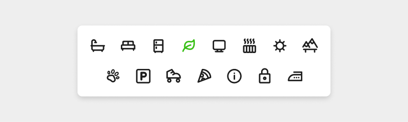
These are the new fancy icons we drew for the newly created categories.
But you said that designing icons is not scalable and maintainable :O
True, I did say that, but the biggest problem is not drawing a specific number of icons, it’s that new amenities are coming every week and it’s hard to constantly be drawing new icons and creating a fallback logic for everything. If we use the icons only on the category level, it’s easy to map new amenities to the existing categories, and introducing new ones does technically not require a designer to be involved.
Having 15 categories and maybe needing to add one or two more is an easy peasy task.
So this is how the lists of amenities were going to look on the website:
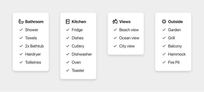
Much better already, wouldn't you say?
And now finally, the 3rd problem - the amount of information being overwhelming and not even needed for all users
I know, all of the information shown is not consumed by 100% of the users, but this was a little different. This data is shown very high up the page (in many cases even above the fold) and also took a lot of vertical space (pushing other important sections further down the page).
So how might we display this information to the people that wanted to see it, hide it from the people that don’t care about it, and also not make it overwhelming?
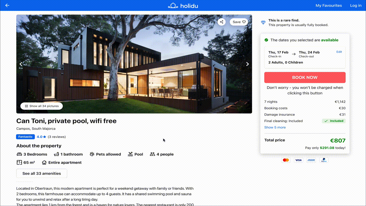
The decision was maybe a bit controversial in the UX world, but we decided to go with a popup that would show up after the users expressed intent to see this information.
We had two questions about these two decisions:
- Where to put the button to open up to popup
- How to display the amenities inside the popup
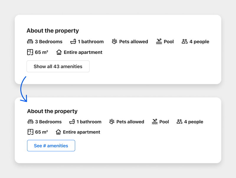
Since we have an “About the property” section on the page, which already shows some of the amenities and general stuff, we decided the popup would fit nicely as an extension of that information.
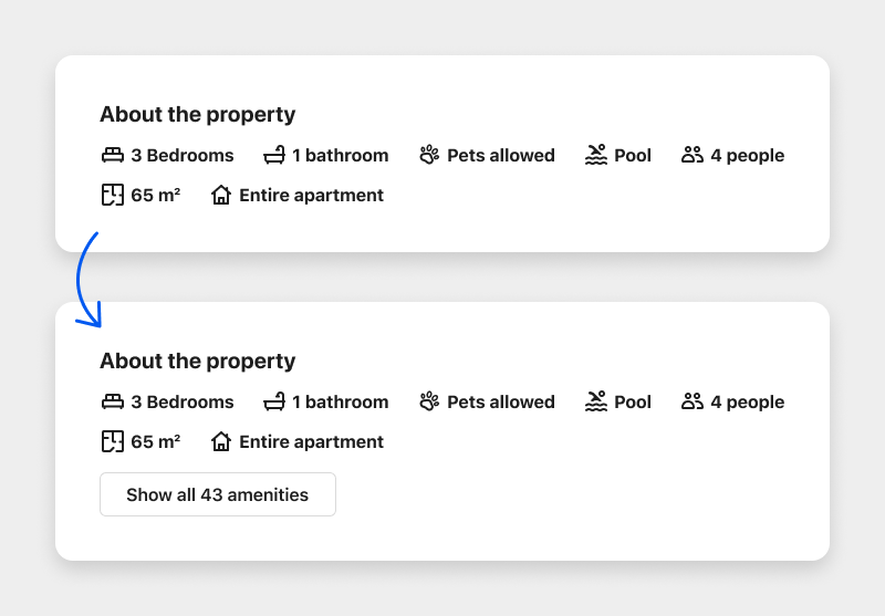
In the popup, we decided to go with a 2-column layout with a specific order in which the categories should follow one another.
We decided on the 2-column because we already know that 3 columns (from the current solution) were too much for the users, and 1 single column would introduce a lot of scrolling.
Metrics
- The first metric we wanted to track with the test is a pretty obvious one: Conversion. Most of the tests we run at Holidu get determined based on their impact on conversion. The idea behind this approach is that if something is easier or more clear to use, it will also impact conversion (that’s not always the case though).
- The second metric we wanted to track was button clicks. We wanted to know if our users are finding the button in a very information-heavy and busy part of the page
- The overall price of the booking (cart value) was also tracked - this would tell us if the users are inclined to make bigger orders (basically spend more money) on the properties, if we showed better categories.
Here is the final solution that was implemented as an A/B test:
Another “hidden” benefit of this solution, was that it made the whole page shorter by around 400-600px (depending on the property) which means that other important sections were further up the page and accessed more easily and with less scrolling, so we were also pretty happy about that.
What were the results?
You’re probably wondering “okay you did all this, but what came of this test?” and you should, because if we don’t measure our changes and improvements in some way, what are we even doing?
Fast forward almost exactly two months, and here are the results:
The overall conversion was basically exactly the same on the higher level, but taking a deep down into some more specific metrics we found out that:
- Conversion on desktops has increased by around 2.6%
- Conversion on mobile was decreased by about 3.6%
- On average, desktop users clicked about 1.5 times on the “See all amenities” button
- On average, mobile each user clicked about 1.5 times on the “See all amenities” button
We started wondering why there is a big discrepancy between a positive trend on desktop and a negative trend on mobile. The ratio in the number of clicks was the same, which means that mobile users do find the button and open up the popup, and look at the amenities.
We realized, that the mobile popup feels like a bit of a dead end, here’s an actual screenshot of the popup on mobile:
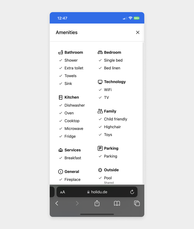
Looks a bit dead-end-ish right? We came up with the hypothesis that users open this popup, and are then not sure what exactly they need to do and even worse, how to close it or get out of it.
To test this hypothesis, we are changing the popup itself a little bit to this:
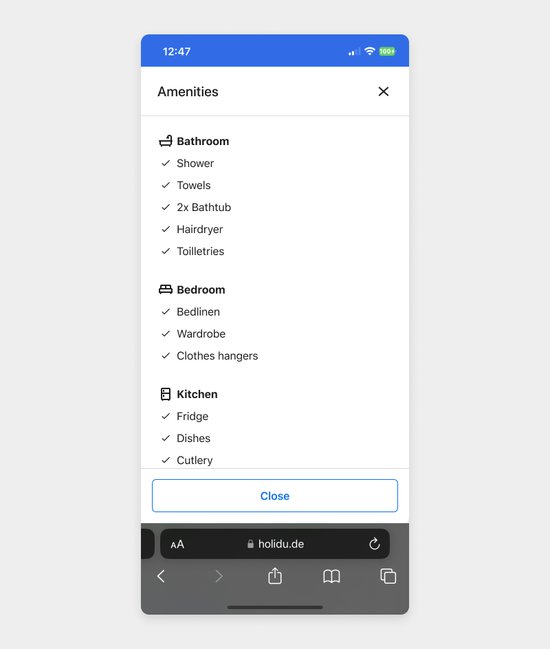
We also added a more prominent button to open the modal:
Results
This one actually got very negative very quickly, so we know, that making the button more prominent was not the way to go.
But why didn’t this work? After all, our hypothesis was, that because the users don’t see the button, they don’t get the information about the Amenities and they do not think that the property is suitable for them. We immediately drew the conclusion that maybe the problem was that our properties might have a low number of amenities and that we are actually highlighting a “bad” thing.
So, we went straight to our BI team, to find a connection between the number of amenities, and the conversion rate. The results were pretty surprising.
What they found out, is that the properties that have a lower number of amenities, actually have a higher conversion rate (10-30 was the best range) and properties with more than 30 were actually doing really bad. But that was a problem for another time, right now, we had absolutely no idea, why our test didn’t work.
Figuring it out
We ran a quick internal testing session to figure out how people find, open up, and close the amenities popup.
We figured out, that most of the people did not use the big “Close” button we added to the bottom of the modal window (we identified that since our modal was fullscreen, people actually thought that it was a new page, not a modal) but rather their browsers built in BACK button. Because the popup windows are not actually a new page, tapping the browsers BACK button, actually took you to a previous page (which could technically be absolutely anything, not even a Holidu site), and not back to the property’s page.
So let’s say you type into Google “Villas in Mallorca”, and you click on a link that takes you to Holidu’s detail page. You open up the amenities popup, but you think you’re on a new page, and you click the BACK button, and you actually get taken back to Google’s search results page.
That doesn’t really seem correct, does it? 😅
We went about fixing that interaction - now when you click on the BACK button with the popup opened, you get taken back to the actual details page, not wherever you were before.
We're still waiting for the result, but at the moment they look promising 🤞
Conclusions and what we learned
- Being transparent and highlighting things more, can potentially hurt you
- If your testing involves some special interactions (like a popup window closing) make sure that they work exactly as they need to before you actually try 3 different iterations.
- This is the most important one: If you really believe in your hypothesis, research, and design, do not give up! Too many times, we believe we have a good hypothesis based on proper research, and our design is good, but after a test being a loser, we just give up and move on. For this amenities one, I really believed that what we are doing is the right way to go, and I didn’t want to give up on it regardless of it being a loser 2-3 times. Imagine if we gave up on this, but didn’t identify that it was all bad because of the popup closing problem. We would have thought, that our idea in general sucks and we have to do something different (or even worse, believed that our status quo is actually a better solution - which clearly, it’s not)