System UI fonts vs Custom fonts: Which path to follow?


When it comes to designing a website, choosing the right font is a crucial decision that can have a big impact on the user experience. One option is using system UI fonts, which are a set of default fonts built into modern operating systems and web browsers.
System fonts offer several benefits, including improved performance and accessibility. However, they may not always be the best choice, especially for websites that require more control over the design and branding of the site. In these cases, custom fonts, also known as web fonts, can be a good alternative.
What is system UI font anyway?
The system UI font is the typeface used in the user interface of a device, such as the text that appears on buttons, menus, and other elements in the operating system. It is chosen by the manufacturer of the device and is typically specific to that brand or device. It is different than “system font“ which is any font that is already installed on the user’s device and does not need to be downloaded when accessing a website. Here are some popular operating systems and their system UI fonts:
| Device | Font |
|---|---|
| macOS | SF Pro |
| Windows | Segoe UI |
| Android, Chrome OS | Roboto |
| KDE | Oxygen / Oxygen-Sans |
| Ubuntu | Ubuntu |
| GNOME | Cantarell |
| Firefox OS | Fira Sans |
| macOS versions < 10.11 | Helvetica Neue |
| Older versions of Android | Droid Sans |
To make it work with the largest amount of users, there are different font stack approaches from different sites. An example from WordPress which is one of the most popular:
font-family: -apple-system, BlinkMacSystemFont, "Segoe UI", Roboto, Oxygen-Sans, Ubuntu, Cantarell, "Helvetica Neue", sans-serif;
Custom fonts, on the other hand, are fonts that are downloaded and applied to a website from a remote server.
Let’s have a deeper look and compare system UI fonts and custom fonts in terms of performance, design flexibility, accessibility, and more. By the end, you'll have a better understanding of the pros and cons of each option and be better equipped to make an informed decision for your website.
Performance
When it comes to performance, system UI fonts are such a beast. Since system UI fonts are already installed on the user's device, they don't have to be downloaded from a remote server as custom fonts do. This can help reduce the overall size of the webpage and improve load times, especially for websites with a lot of traffic or for users with slower internet connections.
Using system UI fonts can also help improve the performance of your website on mobile devices, which often have limited processing power and slower internet speeds compared to desktop computers. By reducing the number of resources that need to be downloaded, you can help ensure that your website loads quickly and smoothly on all devices. There are plenty of good examples of system UI font usage including Booking.com, Github, Unsplash, Atlassian, and more.
At Holidu, the performance of our website is essential to us. However, we were previously using a custom font that was not optimized in terms of the number of weights, variety of characters, hosting, and other factors. Therefore, we decided to test using the system UI font and were amazed by the results.
It’s still not the end of the world for custom fonts though. There are plenty of ways to improve a custom font’s performance like adding a fallback logic, reducing the number of font weights that needs to be loaded, using a font that is optimized for web use, and even removing characters that won’t be used.
Familiarity
System UI fonts are already being used on the user's system and that brings familiarity to that font. Since users are already accustomed to the shape and appearance of the letters, it is often easier to read and navigate. This can make it easier to process and interpret information displayed in the user interface.
Familiarity with the system UI font can also make the user interface feel more comfortable and intuitive, which can lead to greater user satisfaction with the website. In addition, using a familiar system UI font might help reduce the learning curve for new users, as they do not have to learn a new font along with the rest of the product.
Readability
Good readability is vital for the user experience of a website, as it can make the content easier to process and understand. This can lead to greater user satisfaction and engagement with the website. It is therefore important for designers to consider the readability of the system UI font when choosing a font for a website. Factors such as the font's x-height (the distance between the baseline and the top of the lowercase letters), stroke width, and letter spacing can all impact the readability of a font.
System UI fonts are most tested to be legible and easy to read at small sizes and on low-resolution screens, which can be also important for websites that are designed to be accessed from a variety of devices.
That being said, some custom fonts are just as readable as system UI fonts. As an example, Inter is a well-optimized font that performs just as well as system UI fonts. Moreover, it can help create a unique and distinctive visual identity for the website. This can be especially useful for websites that want to stand out and be memorable to their users.
Custom fonts can also be tailored to the specific needs and goals of the website. For example, a custom font can be designed with specific readability characteristics that make it particularly well-suited for a particular type of content or audience. This can improve the overall user experience of the website by making the content easier to read and understand.

Consistency
When you use a system UI font, you don't have as much control over how it looks or performs on different devices. This can lead to inconsistencies, for example, your website will be displayed differently across different platforms. Especially since every operating system has different system fonts, the overall look changes on every platform. On top of that, these fonts can vary a lot in terms of weight, style, character spacing, and so on. This makes the site look rather different on every platform. Some parts can be bolder, some others thinner than they are supposed to be.


The custom font would look mostly the same on different devices but that also means it needs to be downloaded, which may not be possible for all users. This can result in the website appearing differently on different devices, with some users seeing the custom font and others seeing a substitute font. This can impact the overall consistency and cohesiveness of the website's design.
Brand value
Using system UI fonts may not allow you to differentiate your brand or website from others. Custom fonts can help establish a unique and consistent brand identity, which may not be possible with system UI fonts.
In addition to that, it may make your website look more generic and less memorable, as these fonts are widely available and used by many other websites. This can make it more difficult to establish a strong and distinctive brand identity, which can ultimately impact the success and effectiveness of your website.
A custom font can help create a unique and distinctive visual identity for the website. This can make the website more memorable and recognizable to users and can help it stand out from its competitors. A custom font can also be used to reinforce the overall branding of the website, as it can be designed to match the specific design aesthetic and tone of the brand.
Another benefit of using a custom font is that it can give the website more control over its branding and design. A custom font can be tailored to the specific needs and goals of the website and can be designed to convey the desired brand image and personality. This can be especially useful for websites that want to communicate a specific message or emotion to their users.
It's essential to consider the role of branding in your website design and how the font you choose can contribute to or detract from your overall brand identity. If branding is a priority for your website, you may want to consider using custom fonts rather than system UI fonts.
Design workflow
Designers would have trouble creating bulletproof designs with system UI fonts because of font changes on every platform. It’s pretty hard to estimate a width for text and make sure that it would look just as good on every platform. As an example, Windows doesn’t have medium weight (font-weight:500) and once it’s used it falls back to regular (font-weight:400). That’s why Windows doesn’t suggest the usage of the medium font weight. On the other hand, Mac has it and suggests using it since their font is designed to use 700-500-400 weights together.

Another problem is that macOS’s 700 and Windows’s 700 don’t have the same boldness. Windows created 700 just to emphasize a specific text and suggested using 600 for titles, while macOS is using 700 for the titles since their font is more 'narrow'. It makes a huge difference, especially for desktop designs.

Custom fonts, on the other hand, make design processes more streamlined since designers only work with a single font with different weights and make their user tests with this font.
Conclusion
Overall, the decision to use system fonts on a webpage will depend on your specific goals and needs. If you are looking to improve load times and create familiarity for your users, system fonts may be a good choice. However, if you want more control over the appearance and to make your site more in line with your brand, you may want to consider using custom fonts instead.
If you are considering switching between a system UI font and a custom font on your website, it's important to be thorough, cautious, and proactive to ensure a smooth transition. Before making any changes you might consider,
- Testing the new font on different devices and browsers to ensure compatibility and check for any display issues.
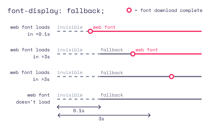
- Using fallback fonts to ensure that your website remains legible and functional if the new font fails to load.
- Informing users about significant changes to the font on your website to give them a chance to adjust to the new font and ensure a smooth transition.
And after making the switch,
- Monitor the performance and effectiveness of the font on your website and optimize it as needed to ensure a positive user experience.
By following these best practices, you can help ensure a successful transition to your new font.