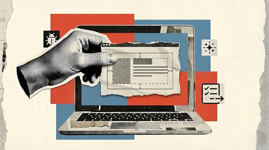
The Designer’s role is shifting, one tiny PR at a time
Last week, I made a tiny UI fix in the codebase for the first time.
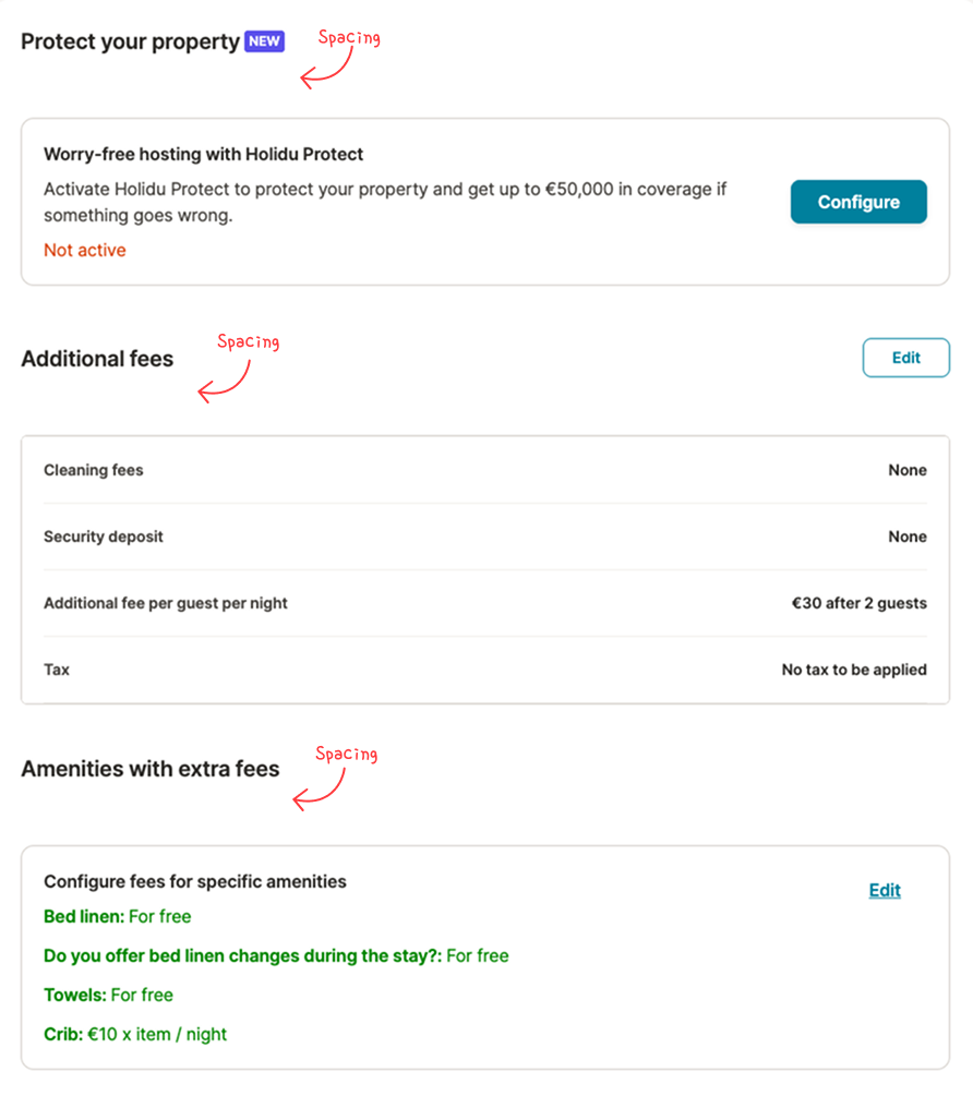
Not a feature. Not a redesign. Just one of those small UI details that makes a screen feel slightly “off” even when everything technically works. In this case, the gap between a section title and the content below was large enough that the page looked a bit disjointed, like the title didn’t quite belong to what it was introducing.
Normally, this is the kind of thing I would notice, mention, and move on from. It’s rarely urgent, and it’s easy to assume it will be picked up “later.”
But I had a study day and a new tool I wanted to explore: Cursor. So I set myself a simple goal: instead of just creating a bug ticket, I would try to fix it myself and open a pull request.
This is the story of that first PR and why I think it hints at a quiet shift in how designers can contribute to product teams.
I chose a small bug on purpose
I didn’t pick spacing because it’s the most exciting work. I picked it because it’s realistic.
Small UI issues are everywhere in products: inconsistent spacing, slightly off alignment, tiny visual hierarchy problems which is normal as the product evolve all the time. They usually don’t block users, but they do affect how a product feels especially in dense screens where users are scanning and configuring things quickly.
They also tend to fall into an awkward category: too small to prioritise against bigger engineering work, but still very real. Which means they often linger.
That’s why they’re such a good starting point if you want to learn the PR workflow as a designer: low-risk, easy to verify visually, and easy to keep scoped.
Cursor made the process feel… friendly
What surprised me was how approachable the process felt thanks to AI.
Not because it “did everything for me,” but because it made it easy to ask questions at exactly the moments I got stuck. Things like:
- “What’s the safest way to start?”
- “What’s the naming convention here?”
- “I’am happy with the changes, what’s the next step?”
- “You offer me two options, what are the trade-offs?”
Cursor felt less like a tool and more like a very patient teammate who never gets tired of basic questions. That changes the vibe entirely. Instead of feeling like I’m interrupting someone or wasting someone’s precious time, I can just keep moving.
The first problem wasn’t the spacing bug
Of course, the first thing I hit wasn’t my spacing issue.
It was the moment that usually creates the biggest “gap” between design and development: I ran the app locally… and nothing showed up. Just a blank screen. No obvious clue, no friendly error message, and no clear next step.
In the past, that is exactly where I would have stopped and asked a developer to unblock me. Not because the problem was impossible, but because this type of setup issue is where the invisible boundaries between roles tend to appear: designers don’t usually spend their day debugging local environments, and developers shouldn’t have to be on standby for every small obstacle.
Instead of turning it into a bigger interruption, I took a screenshot, dropped it into Cursor, and asked what was going on. It pointed me in the right direction quickly.
That was my first real “aha” moment: these blockers aren’t a sign you shouldn’t be doing this they’re simply part of the workflow. And when you can resolve them on your own (or at least narrow them down), the whole experience feels much more accessible.
The fix was “simple”. The path wasn’t.
Once the UI was running, fixing the spacing wasn’t a single “change 40px to 16px” moment.
Like most UI issues in real products, the spacing came from a combination of things, padding here, margin there, and a few rules stacking together. Cursor could propose changes, but I still needed to choose what made sense in the context of the page and our usual patterns.
At one point, Cursor suggested two approaches. I didn’t immediately understand why the recommended option was better, so I asked follow-up questions until it clicked.
That became one of my favourite parts of the process: using AI less as an “answer machine” and more as a way to explore reasoning quickly. I wasn’t just fixing a UI issue, I was learning how the layout was put together, and why some changes are safer than others.
Opening the PR felt simpler than I expected
When the UI looked right, I opened my first pull request.
I expected this to feel intimidating, but it mostly felt… practical. Like: “Here is what I changed, here is why, can someone review it?”
That said, I still had a bit of doubt in the back of my mind: is it okay for me to open a PR, and is what I did good enough? But the alternative was adding another tiny UI bug to the backlog. So I went for it. Either way, I would learn something, and maybe it would work...
What this tiny PR made me realize
The spacing fix itself was small. But the experience gave me a clearer sense of something bigger that’s already happening in many teams and product environment.
Over time, through small changes and iterations, UI details like spacing can drift from their original intent, without a clear point of ownership over how they look in production. Spacing, hierarchy, and visual rhythm are things designers already define, but once a design is handed off, those decisions can easily evolve or go unreviewed as the product grows.
In that sense, fixing this didn’t feel like stepping into a new role. It felt more like taking responsibility for something that was already part of my work.
Designers are getting closer to implementation, not because we’re all turning into developers, but because the tools are making it easier to contribute safely.
I think, there’s a growing middle ground in product work: small UI improvements, minor bugs, polish, accessibility tweaks. Historically, these get delayed simply because the “cost to fix” (context switching, prioritization, review time) is high compared to the perceived impact.
AI tools reduce that cost. They make it easier to:
- start safely,
- ask the right questions,
- iterate quickly,
- let the developers focus on their challenges
And when that cost goes down, the types of work designers can realistically help with expands without stepping on engineering ownership, because review and standards stay with developers.
If you’re curious, start with a tiny fix
If you’re a designer who has been curious about making small changes through code, my honest recommendation is: start with something unglamorous.
Pick a small UI issue you can verify visually. Keep the scope tight. Expect to ask questions and a few blockers. That’s normal.
The biggest win is not “shipping code.” It’s realizing you can participate in that part of the workflow without it being scary or a huge deal.
For me, it started with a small spacing issue. And it ended with something genuinely encouraging: a feeling that “design” doesn’t have to stop at Figma anymore, not always, and not for everything, but more often than we think.
The open question: how far should I take this?
Some questions still stay open for me. As a designer, where should I draw the line between “I identify the issue and propose the solution” and “I can actually implement a small fix myself”? Will this become something I do occasionally for low-risk UI polish, or could it become a more regular part of my workflow? And over time, could I move beyond small UI fixes and handle slightly bigger issues while still staying in a designer role?
I don’t have all the answers yet, but I like that these questions exist. They make me feel like the designer role is expanding in a good way: not just shaping the experience in Figma, but occasionally helping small fixes reach the product faster, with the right guardrails and engineering review. And if that helps us deliver small improvements a bit more often, it’s a win for everyone: designers, developers, and most importantly our users.